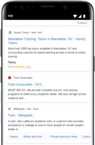
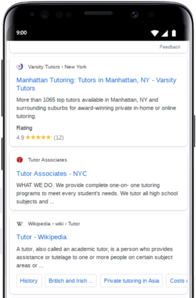
As you may or may not have heard, Google has decided to add a new element to mobile search results. Google has been making quite a number of changes in their search results pages with both paid sponsorships such as new types of shopping (discovery ads) to question and answer sections plus more. However, the newest is the addition of the site favicon next to the listing in each mobile organic search result.
It looked like Google needed an additional graphic of some sort to match up to the small “ad” in the box next to paid listings on search results.

As you may have guessed, you will need to have a Favicon designed for your site. What is a favicon? It’s the little logo symbol associated with your website. Here are some examples.
The favicon appears on the browser tab on desktop and now in the search results on Google on mobile.
The big question is, how do you make your favicon look authoritative?
How Can I Make My Favicon Look Authoritative?
If you look at the many favicons out there, some are very easy to read and others, not so much. Here are our tips on creating an authoritative favicon for your website.
- Stick to 2 colors maximum. The favicon is small and thereby, you won’t see multiple colors if you decide to use them.
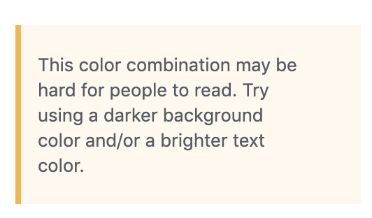
- Use Contrasting Colors in Your Favicon. The best way to read text or images for that matter is to have a strong contrast between the two colors. As you may see, I am typing in black font on a white background which makes it easy to see. This wouldn’t be as easy to see:
If you notice, this is rather difficult to read and if you use this in a small confined spot, it will be even tougher.
Even WordPress is alerting me that this color combination above is a difficult one to read.

3. Choose One Defining Element. Have a logo image that is easy to “read” (whether letters or images) in a small setting? Then use that. If you’re using an image, you want to definitely be certain the image is very easy to pick out.
4. No Logo Image? No Problem. Another excellent option is to use some type of initial. (It’s what we do here at Digital Marketing CEO). Using a first letter of your company name is a great option and it will be easy to read as a favicon since it is only one letter.
5. Color matters. Yes, we’re back to color again. This time it’s not so much about contrast but about the emotion you want to evoke when people recognize your company in search results and in their many tabs they have open at one time. Choose a bold color such as reds or oranges to stand out. Want to evoke calm or tranquility? Go with blue.
Here’s a quick run down of colors and emotions from Canva.
Red: Energy and excitement, sometimes danger.
Orange: Fresh, youthful, and creative.
Yellow: Optimistic and cheerful.
Green: Natural and vitality.
Blue: Calming and trustworthy.
Purple: Royal and majestic.
Brown: Organic and wholesome.
Pink: Sentimental and whimsical.
Black: Sophisticated and luxurious.
White: Pure and simple.
Want to know more about the meanings behind colors? Check out this article from Canva “Color meaning and symbolism: How to use the power of color in your branding.“
6. Repeat, repeat, repeat. Your favicon is a representation of your brand. It must be seen in some form wherever your brand is placed. The colors must match the theme of your company, the symbolism must match and it all must be seen across all digital properties. This means Facebook, Twitter, Instagram, YouTube, Linkedin, and more.
Want one-on-one WordPress tutoring online? Let us know!


