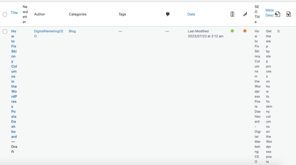
As a WordPress user, you might have encountered a puzzling situation where your well-organized posts dashboard suddenly turns into a jumbled mess with post titles running down the page like a waterfall. Before you panic and start deleting posts in frustration, fear not! Your WordPress is not broken. In fact, there’s a straightforward fix to restore order to your dashboard. Let’s delve into this issue and show you how to fix skinny columns in the WordPress Posts Dashboard. Let’s quickly resolve it.
The Mystery of the Messy Dashboard

Picture this: you access your WordPress backend, excited to work on your blog, only to find your posts dashboard looking like a chaotic whirlwind of single-letter post titles cascading down the screen. It might seem alarming, but there’s no need to worry or jump to conclusions. Your WordPress installation is perfectly fine.
The Easy Fix for Skinny Columns on the WordPress Posts Dashboard
Here’s what you can do to bring back sanity to your posts dashboard:

Locate the “Screen Options” Menu: To begin the process of restoring order, direct your attention to the top right corner of your WordPress posts dashboard. There, you’ll find a small, inconspicuous tab labeled “Screen Options.”
Open the Screen Options: Click on “Screen Options,” and a handy window will unfold at the top of your dashboard page.
Column Chaos Uncovered: The root of the messy dashboard lies in the columns that are currently being displayed. Chances are, too many options are selected for showing columns, creating the disorderly appearance.
Reorganize the Columns: To remedy the situation, you can easily uncheck the boxes of columns that you don’t necessarily need to see in your dashboard. This will help declutter and organize the view.
Watch the Magic Happen: Once you uncheck the unnecessary columns, you’ll notice the miraculous transformation of your WordPress posts dashboard back to its original organized state.
Flexibility at Your Fingertips: If you find that you do need some of those columns to be displayed at a later time, don’t fret! Access the “Screen Options” once again and simply recheck the boxes of the columns you want to see.
There you have it! The mystery of the messy WordPress posts dashboard is now solved. Remember, when the titles of your posts start behaving like a disoriented dance, don’t panic or take drastic measures like deleting posts. The easy fix lies in the “Screen Options” menu, where you can manage the columns displayed on your dashboard efficiently. Uncheck unnecessary options to restore order, and recheck them if needed in the future. With this newfound knowledge, you can confidently navigate your WordPress backend and enjoy a clutter-free blogging experience. Happy blogging!
Related
The Power of Dashboards: How to Setup a ClickUp Dashboard
Why Do You Need Spaces on Clickup
How to Set Up a Space in ClickUp: A Step-by-Step Guide
Clickup Task vs. Folder vs. List